- Home ›
- Shopfittings ›
- Signage
-
Sign Holders
-
Acrylic Signage
-
Brochure Holders & Display Stands
-
Hanging Posters, Signs & Accessories
-
Garment/Clothing Rack Signage
-
End Signs
Retail Shop POP and POS Signage
Tips to Drive Attention and Traffic to Your Store
To get your store noticed and attract customers through your doors, it is important to become proficient in the art of shop signage. Once you understand the different types of signage you can use it to direct customers through your store in a way that is efficient and lucrative.
Here at SI Retail, we know the importance of shop signage. Effective signage not only entices customers through your doors but also:
- Shows them where to find the products they are looking for
- Introduces them to new products
- Alerts them to promotions and bargains
Provided your signage follows some very simple guidelines, you can increase sales and provide your customers with a pleasant shopping experience.
We have put together 5 tips for you to consider when planning your shop signage.
Tip #1: Size Matters
For your shop signage to be effective customers need to be able to read it.
We are not going to lie – we like big fonts. How big? Well, try putting yourself in your customers shoes. Will they be walking past your store? Driving past? Or reading them on package labels?
People with eyesight issues or the elderly, need larger fonts too. Keeping this in mind will help you decide on the size of your fonts to reach out to all your customers.
Tip #2: Use the Right Signage for The Function
All shop signage is not created equal. Being aware of the purpose of your signage is pivotal to selecting the right signs. Let us look at 4 of the most commonly used types of signage:
- Outdoor signage – This tells customers a lot about your store. If your signs are well-maintained and clean a customer will have a positive expectation when entering your store. Your sign should not just tell people where you are, it should also create anticipation. So always place a positive slogan beneath your store name.
- Directional Signs - These help to guide customers through your store and should be highly visible so that they are understood with a single glance. They include signs pointing to specific aisles; where customers can pay; and the location of the restrooms.
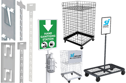
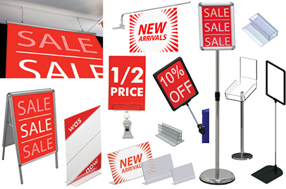
- Promotional signs – These can be placed inside your store when you are running such things as seasonal or festive deals. Sign holders, hanging posters, floor stands, and end signs are all great ways of drawing customer attention to promotions and deals that your store is offering.
- Point of Purchase Signs – This type of shop signage acts as your key sales pitch. Place it in such a way that your customers are guided to the aisles or areas in your store where they will find your sale items or best-selling products. These signs can be used to fuel impulse buys such as you would find in dump bins.
Tip #3: Know Where to Place Your Shop Signage
There are certain factors that will dictate where you place your signage. For example, directional signage will be higher than eye-level in an aisle or will hang down from the ceiling so your customers can see it as they pass through your store. Promotional signage such as feather flags will be at ground level and can be placed outside your store to attract people passing by. Alternatively, promotional signs will be placed at eye-level in your shop window display.
Keep in mind, too, that ‘eye-level’ is different for different people e.g. people in cars, children, and wheel-chair users. For this reason, you will need to test out the position of your signage to decide on the most effective height for prospective customers while also bearing in mind the signs intended function.
Tip #4: Keep Your Copy Bold and Concise
When it comes to text on shop signage less is more. Keep it simple and use the minimum number of words to get your message across.
It is just as important to bear in mind the number of signs that you are using in any one given area. It is distracting for customers to be bombarded with tons of cluttered wordy signs when they are trying to browse a section or make a purchase.
Instead, keep in mind the intent of the signage and be sparing with your words. Clarity is important so use fonts that are bold, clear, and on-brand for maximum impact.
Tip #5: Getting to Grips with Colour Theory
There is a lot to think about when choosing colours for your signs. Firstly, start by using contrasting colours in your retail shop signage – such as white text on a black background or black on white.
Another thing to consider is the emotion connected with certain colours. For instance, blue, green and aqua are regarded as tranquil colours and are great for self-care brands and eco-friendly products. Warm colours like red and yellow impart excitement which is why sale signs are traditionally produced in bright red hues.
Black is associated with power, strength, and luxury which makes it perfect for luxury footwear and high-ticket items whereas white is associated with hygiene, health, or a new beginning. Think lab coats, kitchen appliances, and weddings.
Bringing it all together
How you implement your shop signage can make or break your customers in-store experience. From the fly banners or black boards outside your store to the directional signs indicating where the exit is located, your signage needs to be clear, concise, on-brand, and easy for all customers to see. Follow these tips and your signage will never fall flat.
Click into the boxes above to find out more about our shop signage products.
-
 Shopfittings
- Shop Shelving
- Shelf Lighting
- Shelf Management
- Gravity Roller Shelves
- Display Hooks
- Data Strips
- In-Queue Merchandising System
- Product Display Systems
- Slatwall Accessories
- Signage
- Shopping Trolleys & Baskets
- Pallet Guard
- Miscellaneous Items
- Clearance
-
 Shop Fittings by Industry
- Automotive
- Fashion
- Hardware
-
Pharmacy
- Shelving
- LED Shelf Lighting
- Gravity Roller Shelves
- Shelf Management
- In-Queue Merchandising System
- Data Strips
- Display Hooks
- Shopping Trolleys and Baskets
- Slatwall Accessories
- Signage
- Product Display Systems
- Pallet Guard
- Miscellaneous Items
-
Sports/Leisure
- Shelving
- In-Queue Merchandising System
- Product Display Systems
- Data Strips
- Display Hooks
- Slatwall Accessories
- Signage
- Shopping Trolleys and Baskets
- Pallet Guard
- Miscellaneous Items
- Supermarket & Convenience


