Choosing professional signage
As people say, first impressions count and signage is often the first perception that customers will get about your business. Not only is it a cost effective marketing tool to promote, communicate and brand your store and its products but it makes life easier for your customers. From the window to the point of sale, there is certain information that customers need to know to get to the next step of the buying cycle. External signage should convince shoppers to enter, and internal signage guides and persuades them to buy.
[caption id="attachment_560" align="alignleft" width="288"]Rays Outdoor Internal signage Rays Outdoor Internal signage[/caption]
[caption id="attachment_562" align="alignleft" width="261"]Ray's Outdoor external signage Ray's Outdoor external signage[/caption]
As shoppers walk past your store in the street you have 3 seconds to display a message that grabs their attention. Remember, shoppers love shopping, you only have to give them a reason for it. As they walk inside, your signage should guide customers through your store, improving their experience and slowly informing them about the categories of products they can find, the current promotions and the new range available. Professional signage will display the right amount of information at the moment when the customer needs it.
Unprofessional signage can confuse people. It is like a poorly designed website, you might enter but you will leave before even browsing through the products, so, what are the common mistakes retailers make with signage?
Too many signs
Research shows that people have trouble choosing when there are too many choices available. Think about the headache you get when trying to pick a toothpaste in a supermarket. Well, too many signs is like too many toothpastes, it does not help you to make an informed decision.
Misleading signs
Some signs are accidently misleading because of their placement or what they are associated with but others signs are purposely ambiguous especially the sale signs. For example, a promotion might say "Up to 50% off," but the "up to" is so tiny all you can see is the 50% off. Â Another example is an item displayed with a sale tag when the product is not actually on sale. Those techniques might increase traffic but probably not sales as customers will be disappointed.
[prw username="siretail" boardname="Unprofessional-Signage" maxfeeds="10" divname="myList" printtext="0" target="newwindow" useenclosures="yes" thumbwidth="100" thumbheight="100" showfollow="medium"]
Too much information
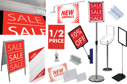
Different information needs to be communicated at different moments in the buying cycle; you don't display your price policy on the door. You could for example, display a SALE sign on your window to attract attention, a 50% off sign on a freestanding display to orientate customers to your store hot spot and product information on the tag. More detailed information such as warranty policy can be displayed at the check out because people have time to read and they have already decided to buy.
Consistency
Signage is like guides, keep them consistent so customers can identify their role.
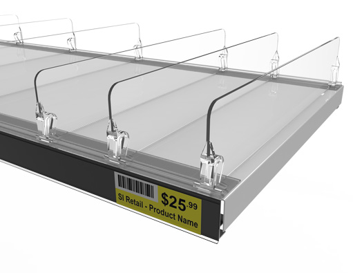
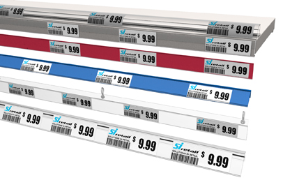
[caption id="attachment_568" align="alignleft" width="300"]Coles Data Strip | Signage Coles Data Strip | Signage[/caption]
Design problems
Signage needs to fit your store concept and colours. One of the most important design elements of a sign is its colours. You can increase visibility by contrasting a light colour font on a dark background or the other way around. The font should always be simple and if you decide to use a graphic it should not distract the customer from the main message. At the bottom of this article is a colour chart that will help you understand how to use colours. Another tip is to add a border to your sign, according to a study by the Pennsylvania College of Optometry, adding a border enables the reader to understand it 26 percent faster.
After placing your signs around your store, put yourself in your customer's shoes. Walk from the next street up to the front door, and then wander through your store. Do you gain knowledge from the signs? Are you able to navigate the store more easily through signage? Are you directed first to the hot spot of the store?
The take home message is that an effective sign is CLEAR and SIMPLE
For generic signage, from data strip to poster hangers, check out our range of professional signage at www.siretail.com.au. For custom signs give us call on 1300 434 775
Data strips: https://www.sishop.com.au/products-c-11/data-strip-c-11_22
Signs and ticket frame: https://www.sishop.com.au/products-c-11/sign-ticket-frames-c-11_61
Promotional signage: https://www.sishop.com.au/products-c-11/promotional-signage-c-11_54
Pre Printed Tickets: https://www.sishop.com.au/products-c-11/pre-printed-tickets-c-11_68
Hanging Signs & Accessories: https://www.sishop.com.au/products-c-11/hanging-signs-accessories-c-11_74
Colour Chart
[embedit snippet="colours"]


